
.svg)
.svg)
.svg)
What is a Sales Dashboard?
A sales dashboard is a powerful tool that tracks and presents your sales data in real-time. It gives you a clear view of your sales performance, helping you understand how your sales team is performing and what areas need attention.
Whether you're a top sales representative, manager or a team member, a sales dashboard keeps you informed and helps you make better decisions.
Why Do You Need a Sales Dashboard?
Sales dashboards simplify complex data. Instead of going through multiple reports, you can view all your key sales metrics in one place. This saves time and helps you spot trends quickly.
For example, if your sales pipeline is slowing down, the dashboard will highlight this, so you can take action immediately.
Top 12 Sales Dashboard Examples
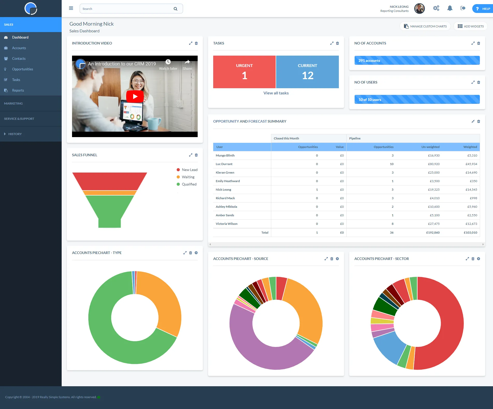
1. Sales Manager Dashboard
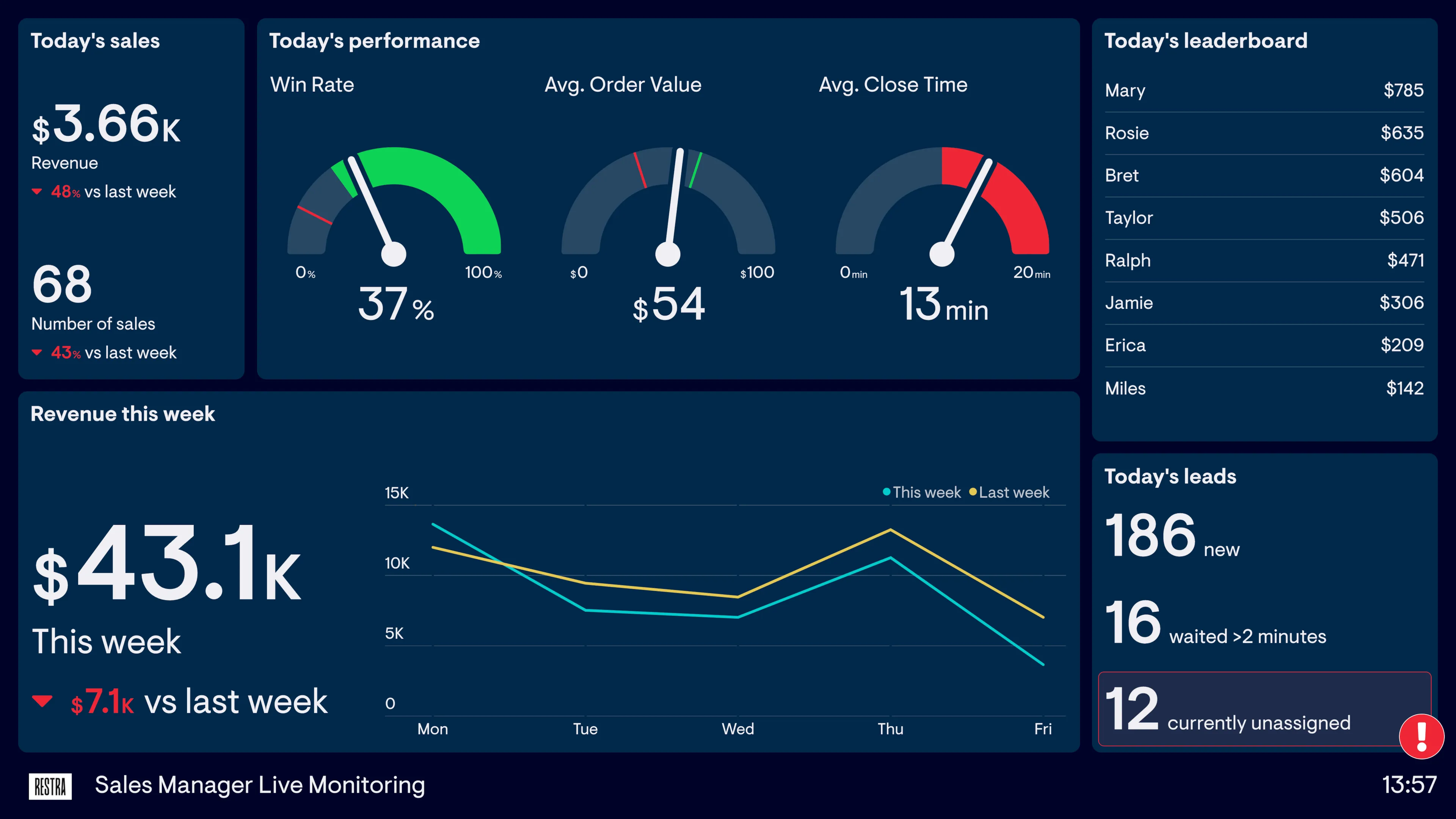
A Sales Manager Dashboard is dashboard example of a tool designed to give sales managers a quick overview of their team's performance. It shows key metrics like total sales, sales by rep, and progress toward sales goals
Why use it:
Sales managers need to track their sales rep dashboard and team's performance in real-time. This dashboard helps them see who is meeting targets and who might need extra support. It also helps managers allocate resources more effectively.
Key Features:
- Sales Performance Tracking: Monitor individual and team sales performance.
- Sales Goals: Keep track of progress toward monthly or quarterly targets.
- Sales Reps Overview: Get a clear picture of each sales rep's contributions.
2. Sales Pipeline Dashboard
A Sales Pipeline Dashboard helps you track the status of deals in your sales process. It shows where each deal is in the pipeline, from the initial contact to closing.
Why use it:
Understanding where your deals stand in the pipeline is crucial for forecasting and planning. This dashboard lets you see which deals are close to closing and which ones need more attention. It helps prevent lost deals by keeping everything on track.
Key Features:
- Pipeline Stages: Visualize deals at each stage of the sales process.
- Deal Velocity: See how quickly deals are moving through the pipeline.
- Revenue Forecasting: Estimate potential revenue based on the current pipeline.
3. Lead Source Analysis Dashboard

The Lead Source Analysis Dashboard tracks where your leads are coming from, such as social media, referrals, or email campaigns. It helps you understand which sources generate the most qualified leads.
Why use it:
Knowing where your best leads come from allows you to focus your marketing and sales efforts on the most effective channels. This dashboard helps you allocate your budget and resources more efficiently.
Key Features:
- Lead Tracking: Monitor the performance of different lead sources.
- Conversion Rates: See which sources lead to the highest conversion rates.
- Marketing ROI: Measure the return on investment for each lead source.
4. Sales Growth Dashboard

A Sales Growth Dashboard tracks how much your sales are increasing over time. It shows you how well your sales strategies are working.
Why use it:
You need to know if your sales are growing or if they’re stuck. This sales dashboard example helps you spot trends in your sales growth. If your sales are increasing, you’ll see it right away. If they’re not, you can make changes quickly.
Key Features:
- Revenue Growth: See how much revenue is increasing month over month.
- Sales Targets: Track if you’re hitting your sales goals.
- Sales Performance Over Time: Compare sales growth over different periods, like weekly or quarterly.
5. Customer Acquisition Cost (CAC) Dashboard
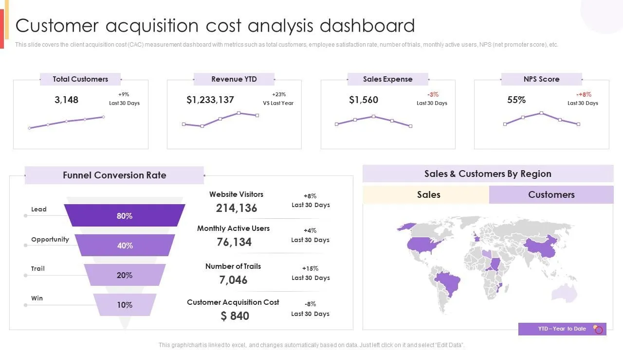
The Customer Acquisition Cost (CAC) Dashboard shows how much money it takes to get a new customer. It calculates all the costs involved in attracting sales leads and converting a lead into a paying customer.
Why use it:
Knowing your CAC is important because it tells you if your marketing and sales strategies are cost-effective. If you’re spending too much to get new customers, your business may struggle to be profitable. This dashboard helps you find ways to lower your costs.
Key Features:
- Cost Breakdown: See where you’re spending money, like on ads, salaries, and tools.
- CAC Trends: Track changes in customer acquisition costs over time.
- Comparison to Revenue: Compare your CAC to the revenue each customer brings in.
6. Customer Lifetime Value (CLV) Dashboard
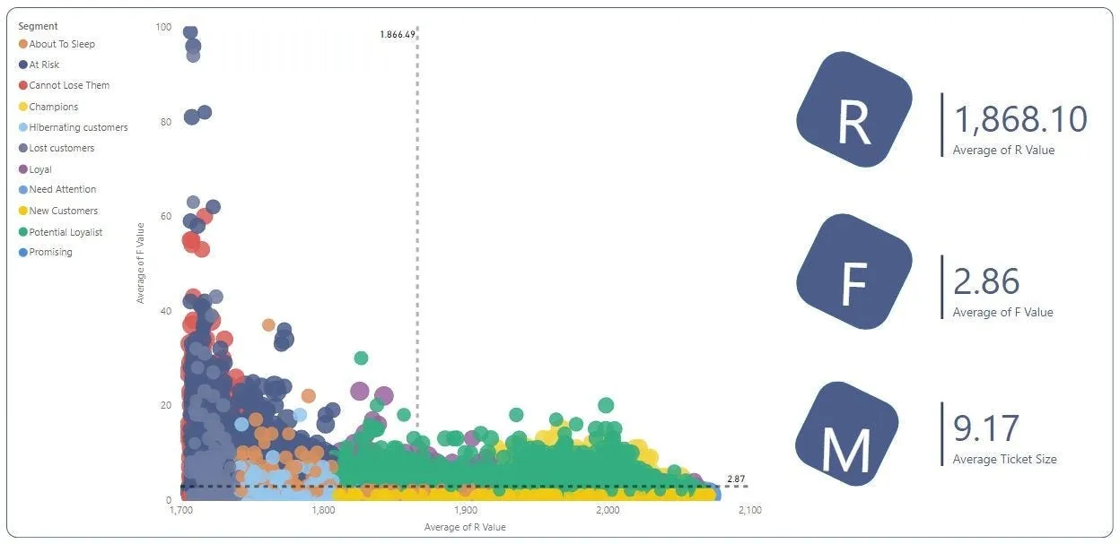
A Customer Lifetime Value (CLV) Dashboard measures the total revenue you can expect from a customer over the time they stay with your business. It helps you understand the long-term value of your customers.
Why use it:
CLV shows you how much profit each customer will bring over time. It helps you decide how much you should spend on acquiring and keeping customers. If your CLV is high, you can afford to spend more on customer acquisition.
Key Features:
- Average Revenue Per Customer: See how much each customer is worth to your business.
- Retention Rate: Track how long customers stay with your business.
- CLV vs. CAC: Compare the lifetime value of customers to the cost of acquiring them.
7. Quota Attainment Dashboard

A Quota Attainment Dashboard tracks how close your sales team is to meeting their sales targets. It shows the percentage of the quota that has been achieved, helping you monitor individual sales reps' progress.
Why use it:
This dashboard is important because it helps you see if your sales team is on track to meet their goals. If they are falling behind, you can take action quickly to get back on track.
Key Features:
- Quota Progress: See how much of the sales target has been achieved.
- Sales Performance: Track individual and team performance against quotas.
- Real-Time Updates: Monitor progress in real-time to make timely decisions.
8. Sales by Region Dashboard
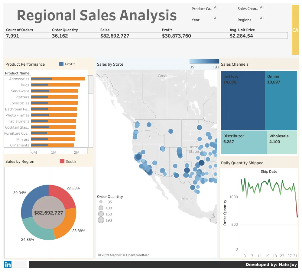
A Sales by Region Dashboard breaks down your sales data by geographic location. It shows you which regions are performing well and which may need more attention.
Why use it:
This dashboard helps you understand where your sales are strongest and where you might need to focus more effort. It’s especially useful for businesses with sales teams that operate in multiple regions.
Key Features:
- Regional Sales Performance: Compare sales across different regions.
- Revenue Breakdown: See which regions contribute the most to your total sales.
- Identify Opportunities: Spot regions that have potential for growth.
9. Sales Forecasting Dashboard
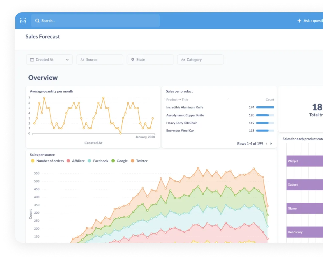
A Sales Forecasting Dashboard predicts future sales based on historical data. It helps you make sales strategy and estimate how much revenue you can expect in the coming weeks or months.
Why use it:
Sales forecasting is critical for planning and decision-making. This sales overview dashboard allows you to prepare for future demand, set realistic sales goals, and allocate resources effectively.
Key Features:
- Predictive Analytics: Use historical sales data to forecast future performance.
- Revenue Projections: Estimate potential revenue for upcoming periods.
- Sales Trends: Track trends over time to make informed decisions.
10. Deal Velocity Dashboard

A Deal Velocity Dashboard shows how quickly deals are moving through your sales pipeline. It tracks the time it takes for a lead to become a closed deal.
Why use it:
Speed matters in the sales funnel. If deals take too long to close, it can hurt your sales performance. This dashboard helps you identify bottlenecks in the sales process so you can speed things up.
Key Features:
- Time Tracking: Measure the average time it takes to close deals.
- Pipeline Stages: See how long deals spend in each stage of the sales pipeline.
- Identify Delays: Spot which deals are stuck and need attention.
11. Sales Performance Dashboard

A Sales Performance Dashboards provides an overview of how well your sales team is doing. It shows important sales metrics, like total sales, sales targets, and individual performance.
Why use it:
This dashboard helps you keep track of your sales leaders and team’s performance in real-time. It shows who is hitting their sales goals and who might need extra support.
Key Features:
- Sales Goals Tracking: Monitor progress toward monthly or quarterly sales targets. A Sales KPI dashboard helps you track key performance indicators that are crucial for measuring success.
- Team Performance: Compare the performance of different sales reps.
- Sales Metrics: Track key metrics like conversion rates and total sales.
12. Sales Reporting Dashboard
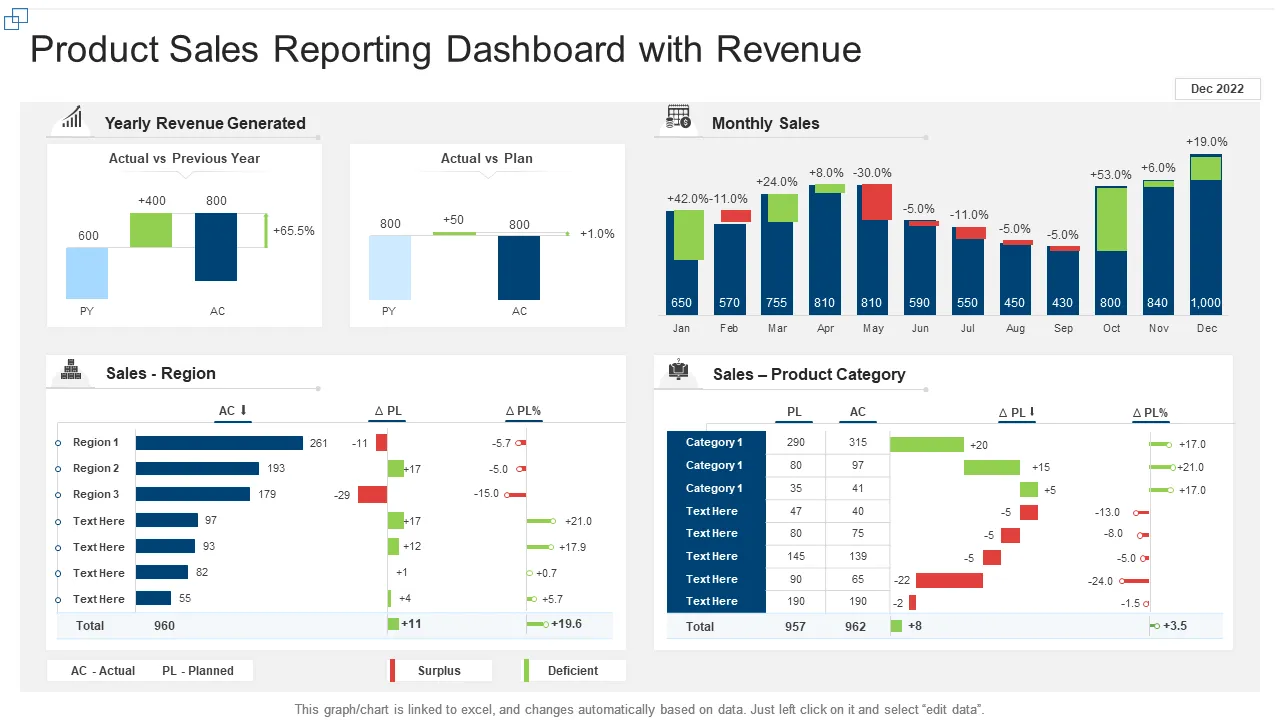
A Sales Reporting Dashboard summarizes your sales data in easy-to-read reports. It provides a snapshot of your overall sales performance and helps you share this information with others.
Why use it:
Regular reporting is essential for understanding how your sales strategies are working. This dashboard simplifies the process of generating reports, so you can quickly share insights with your team or management.
Key Features:
- Customizable Reports: Create reports that focus on the data that matters most to you.
- Visual Data: Use charts and graphs to make the data easier to understand.
- Automated Updates: Keep your reports current with real-time data.
How to Create Your Own Sales Dashboards

1. Start with Sales Metrics
Sales metrics are numbers that show how your sales team is performing. These include total sales, conversion rates, and sales targets. They help you understand what’s working and what’s not.
Here's how to do it:
- Pick Key Metrics: Decide which numbers are most important for your business. For example, if you want to focus on how quickly your sales reps close deals, track that.
- Set Goals: Use these metrics to set clear goals for your team. This way, you can easily see if you’re meeting your targets.
- Review Regularly: Make sure to update and review your metrics often to stay on track.
2. Choose the Right Sales Dashboard Template
A sales dashboard template is a pre-made layout that helps you organize your sales data. It makes it easier to see all your important numbers in one place.
Here's how to do it:
- Select a Template: Choose a template that fits your needs. If you’re tracking sales performance, pick a template that shows metrics like total sales and sales by region.
- Customize It: Adjust the template to focus on the data that matters most to you. For example, if you need to track your sales pipeline, make sure that’s highlighted in the template.
- Make It User-Friendly: Ensure the template is easy to read and navigate, so you can quickly find the information you need.
3. Incorporate Sales Team Data
Sales team data is the information about how each person on your sales team is performing. It shows who is meeting their goals and who might need some help.
Here's how to do it:
- Track Individual Performance: Use your dashboard to see how each sales rep is doing. This helps you identify top performers and those who might need extra training.
- Compare Team Members: Look at how different team members are performing compared to each other. This can help you spot trends or issues.
- Use Data for Coaching: If someone is struggling, use the data to coach them on where they can improve.
4. Focus on Sales Pipeline Insights
The sales pipeline is the path that a deal takes from the first contact with a customer to the final sale. Sales pipeline insights help you understand the sales cycle and where deals are in this process.
Here's how to do it:
- Monitor Pipeline Stages: Track where your deals are in the pipeline. This can help you see which deals are close to closing and which need more attention.
- Spot Bottlenecks: Identify where deals are getting stuck and find ways to move them forward.
- Prioritize Deals: Focus on the deals that are most likely to close soon. This helps you make the best use of your time and resources.
5. Highlight Key Performance Indicators
KPIs, or Key Performance Indicators, are the most important numbers that show how well your business is doing. They can include metrics like total sales, conversion rates, or customer satisfaction scores.
Here's how to do it:
- Identify Important KPIs: Choose KPIs that align with your business goals. For example, if you want to increase sales, track total sales and conversion rates.
- Display Prominently: Place these KPIs front and center on your dashboard, so you can see them at a glance.
- Regularly Update: Keep your KPIs updated with the latest data to ensure your dashboard always shows the current performance.
6. Include a Sales Leaderboard
A sales leaderboard ranks your top sales executives and team members based on their performance. It shows who is leading in sales and who might need some help.
Here's how to do it:
- Rank Sales Reps: Use the leaderboard to rank your sales reps based on key metrics like total sales or deals closed.
- Motivate Your Team: A leaderboard can inspire friendly competition and motivate your team to perform better.
- Keep It Updated: Make sure the leaderboard is updated regularly, so your team knows where they stand.
7. Integrate Customer Relationship Management (CRM) Data
CRM data includes all the information you have about your customers, such as contact details, previous interactions, and purchase history.
Here's how to do it:
- Connect Your CRM System: Integrate your CRM data into your sales dashboard to get a complete view of your customers.
- Track Customer Interactions: Use the dashboard to monitor customer interactions and identify opportunities for follow-ups or upselling.
- Improve Customer Relationships: By having all customer data in one place, you can provide better service and build stronger relationships.
6 Key Tips for Designing Effective Dashboards
1. Keep It Simple
A simple dashboard is easier to read and understand. It lets you focus on the most important data without getting lost in unnecessary details.
- Limit the Number of Metrics: Include only the most essential sales metrics, like total sales and sales pipeline status.
- Use Clear Visuals: Use easy-to-read charts and graphs that make the data clear at a glance.
- Avoid Clutter: Keep the design clean by avoiding too much text or too many elements on one screen.
2. Ensure Real-Time Data Updates
Real-time data keeps your dashboard up-to-date. This helps you make quick decisions based on the latest information.
- Connect to Live Data Sources: Ensure your dashboard pulls data directly from your sales systems in real-time.
- Automate Updates: Set your dashboard to refresh automatically so you always have the most current data available.
- Monitor Key Metrics: Keep an eye on real-time metrics like total sales and sales team performance to stay on top of your business.
3. Incorporate Sales Pipeline Visualization
Visualizing your sales pipeline helps you see where each deal is in the process. This makes it easier to track progress and spot any issues.
- Use a Funnel Chart: A funnel chart can show the stages of your sales pipeline and highlight where deals are in the process.
- Track Pipeline Health: Include key metrics like the number of deals at each stage and the average time deals spend in each stage.
4. Use Consistent Color Schemes
Consistent color schemes make your dashboard easier to read. They help users quickly understand the data by associating colors with specific metrics.
- Pick a Color Palette: Choose a color palette that matches your brand. Stick to it across all your charts and graphs.
- Assign Colors to Data: Use the same color for the same type of data. For example, always use green for growth and red for decline.
- Avoid Overusing Bright Colors: Too many bright colors can be distracting. Use them sparingly to highlight important data.
5. Leverage Data Visualizations
Data visualizations like charts and graphs make complex information easier to understand. They help you see trends and patterns quickly.
- Choose the Right Visuals: Use bar charts for comparisons, line graphs for trends, and pie charts for proportions.
- Label Clearly: Make sure your charts and graphs have clear labels so everyone knows what the data represents.
6. Ensure Mobile Compatibility
Many people check dashboards on their phones or tablets. A mobile-friendly design ensures your dashboard is accessible anywhere.
- Use Responsive Design: Make sure your dashboard adjusts to different screen sizes without losing functionality.
- Test on Multiple Devices: Check how your dashboard looks and works on phones, tablets, and computers.
- Simplify for Mobile: Keep your mobile dashboard simple. Focus on the most important data and minimize the need for scrolling.
Conclusion
A well-designed sales dashboard is key to making smart decisions. It helps you track sales performance, manage your sales team, and stay on top of your goals. By following these tips, you can create a sales dashboard that is simple, effective, and tailored to your needs. Keep your data updated, use clear visuals, and focus on the metrics that matter most. Your sales success depends on it!